Matplotlib can automatically set x and y values based on the value range of the variable. But you can also customize the range of values on the x and y axes by the method set_xlim(xmin, xmax) and set_ylim(ymin, ymax). When setting a 3D image, the z-axis will be added. You can use set_zlim(zmin, zmzx) to set the z-axis. This article will show you examples of how to set the x and y axes value range.
1. Matplotlib Set The Value Range Of X And Y Axes Example.
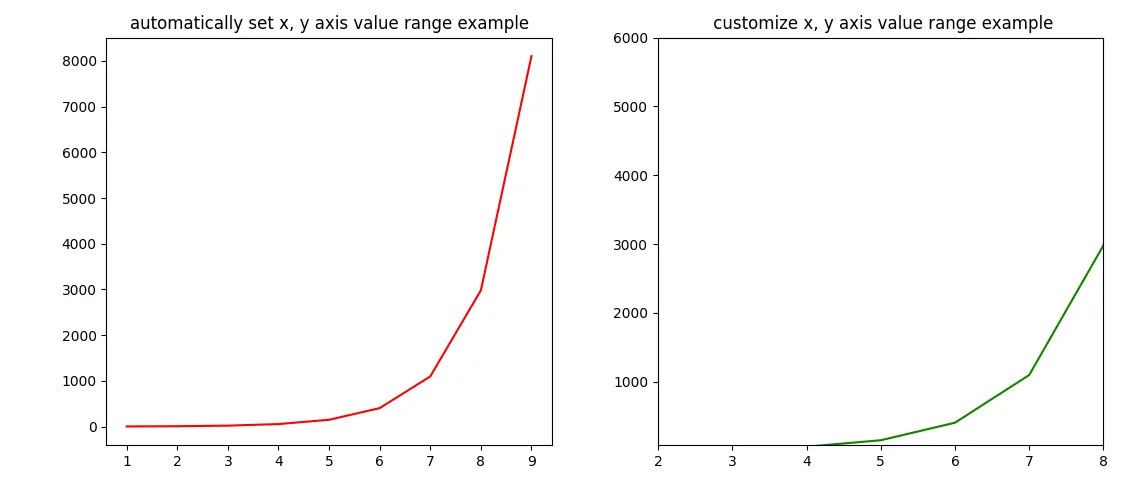
- This example contains 2 plots.
- The left plot uses the Matplotlib automatically generated x and y axes value range.
- In the right plot, it customize the x and y axes value range with the set_xlim(xmin, xmax) and set_ylim(ymin, ymax) methods.
- Below is the example source code.
import matplotlib.pyplot as plt import numpy as np def set_plot_axis_value_range(): # prepare the x and y axis's values. x_axis_value_array = np.arange(1, 10) y_axis_value_array = np.exp(x_axis_value_array) # the plot canvas is divided into 1 row and 2 columns. # get the left plot object. axes1 = plt.subplot2grid((1,2),(0,0),colspan = 1, rowspan = 1) # set the left plot title. axes1.set_title('automatically set x, y axis value range example') # plot the left figure, the curve's color is red. axes1.plot(x_axis_value_array, y_axis_value_array, color='r') # get the right plot object. axes2 = plt.subplot2grid((1,2),(0,1), rowspan = 1, colspan = 1) # set the right plot title. axes2.set_title(' customize x, y axis value range example') # plot the right figure, the curve's color is green. axes2.plot(x_axis_value_array, y_axis_value_array, color='g') # set the right figure's x and y axis's display value range. axes2.set_xlim(xmin = 2, xmax = 8) axes2.set_ylim(ymin = 80, ymax = 6000) # display the plot. plt.tight_layout() plt.show() if __name__ == '__main__': set_plot_axis_value_range() - Below is the above example created figure.